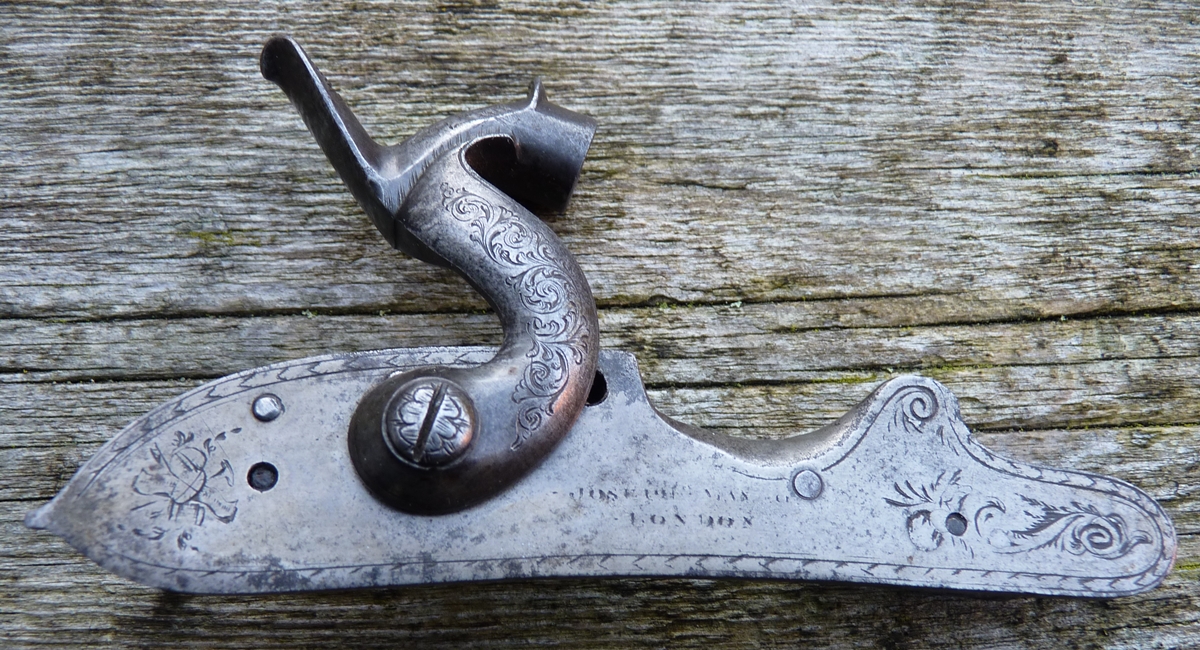
Robin asked me to rescue this lock that had been converted to percussion and also savagely worked on at some later point – it isn’t clear what the objective was, but its a bit of a mess and I don’t feel that I’m violating my principles of not destroying historical material by recutting it – I’ll make sure I leave my initials on the inside of the lock….
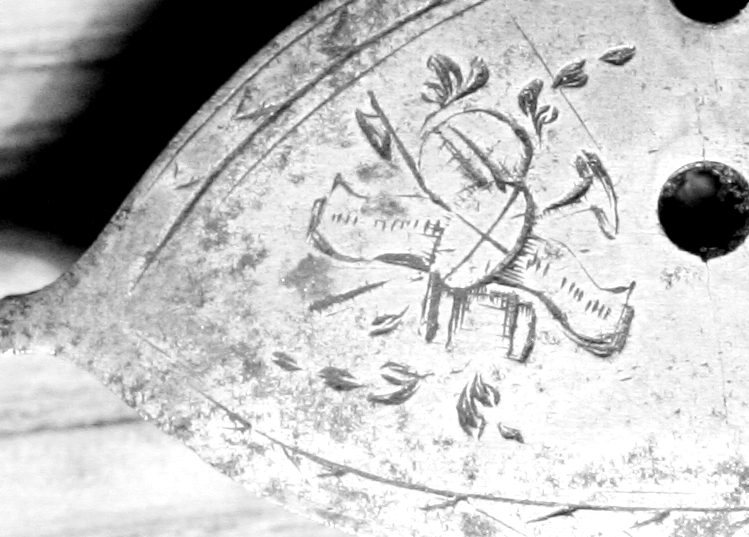
Robin’s Lock in a sorry state – the engraving on the nose obviously dates from the conversion at least 30 years after the lock was made.
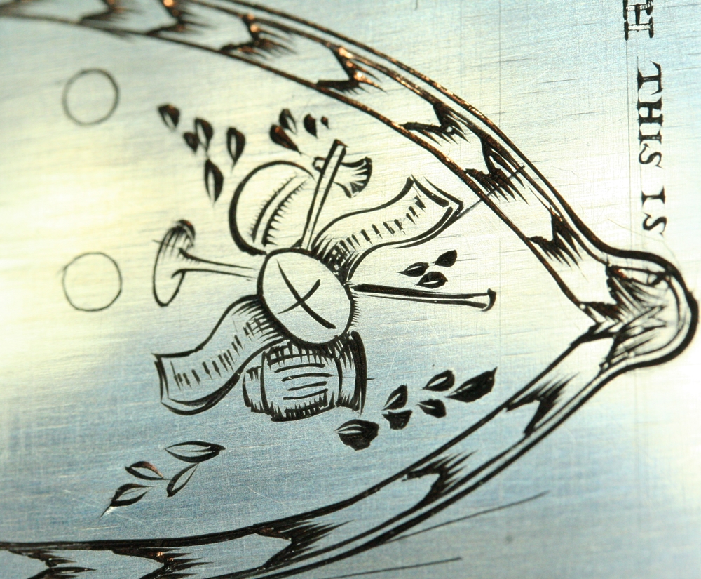
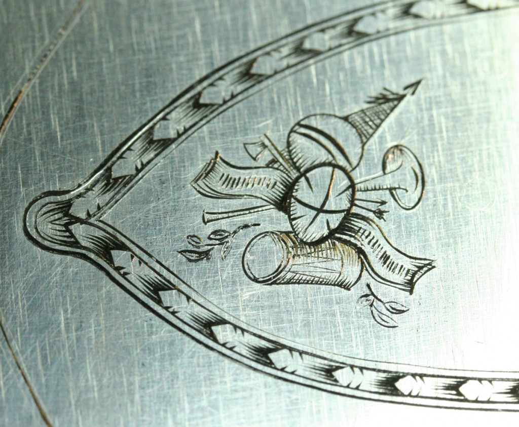
The tail has a ‘stand of music’? engraving somewhat similar to the ‘?stand of arms’ I just recut on Fred’s butt tang – I can’t identify most of the elements on this one either, but it must be a standard design of the period (update – see separate post ‘ Stand of Arms’ for history of this pattern) .
To read more ….
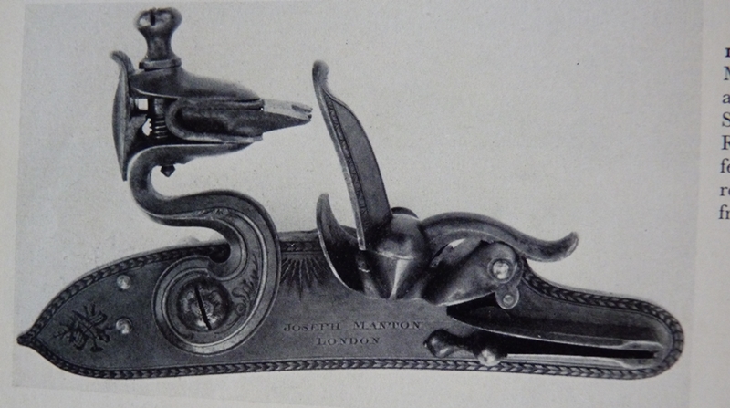
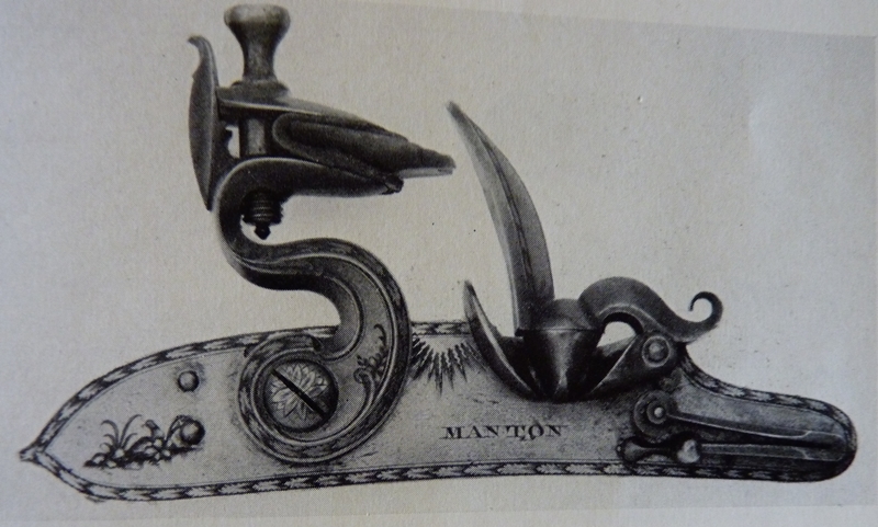
The lock is from an 1803 gun, and conforms perfectly to the style that Joseph and John Manton were both using at that period – it is worth noting that they were both using William Palmer to do their engraving, at least into the late 1700s – The plain flat lock with the leaf border and the ‘teat’ on the rear end seems to have been their preferred design from the late 1790’s until about 1805. Prior to this style the edges of the lock were bevelled and usually without engraved decoration with both teat and a step down tail – they also had a characteristic set of notches cut in the top edge of the lockplate in front of the cock and overall had an elegant simplicity. After 1805 ish the rear end was cut off flat or left rounded and often stepped down (again). Overall, I don’t particularly warm to the look of the late 1790’s/early 1800s locks, they look a bit clumsy compared to both the earlier and later designs, and they had engraved decoration from what was probably the least attractive period of gun engraving ! Here are two photos from W Keith Neil’s book on the Mantons;
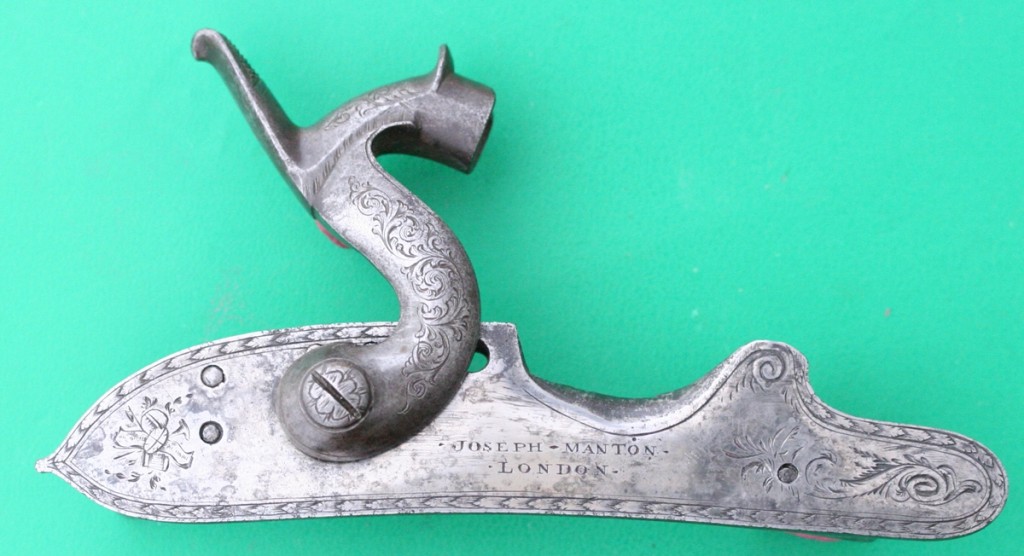
Finished lock – dark patch near the nose is a shadow!
Joseph Manton 1799
John Manton 1801 – this is a pretty good match for Robin’s Lock plate
What’s to do?
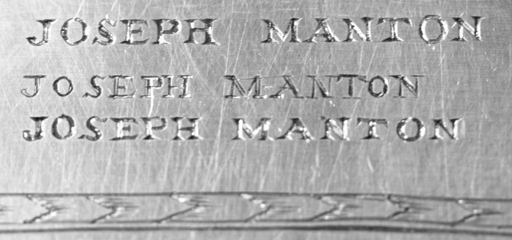
First step was to check the books to see what I was dealing with and confirm that it is ‘right’ – it is, but the ubiquitous ‘sunburst’ is missing – is it behind the cock or filed off? No sign of it on the lock, which I have now stripped. The lettering is going to present a slight problem – the original is very neat although the spacing is maybe a bit erratic as it often was – but the terminal ‘N’ of MANTON is now partly obliterated by a stud through the lock that forms the support for the mainspring top arm, which was obviously added when the lock was converted to percussion – the mainspring must have been changed. Here is the lettering;
The space for the T is rather long and the O is close to the ‘new’ stud. The J and the M appear to be very finely cut. The two N’s in London seem to be slightly different sizes. The lettering is very small – 1.2mm high and has very fine serifs – quite a challenge as I don’t have any tools to cut very fine lines at the moment. Always a new challenge.
Second step.. When I touch the lock with a graver it is clear that it is glass hard – I can hardly make a scratch, let alone a cut, so next step is to ‘let down’ the plate by annealing it at dull red heat and letting it cool very slowly – I do that by heating it and then sticking it in a pile of hot wood ash. Since I don’t have a furnace with a nitrogen atmosphere, I’ll get some oxidation of the iron, so I’ll put it in my derusting tank for a few minutes to strip it off….
Before I anneal the lock I think I’ll probably get Jason to run a very fine weld around the stud ( I am a bodger with TIG welding! )- it doesn’t need to be removable – so that I can file it flush and put the ‘N’ on top of the stud in its proper place – I had better check with Robin that he is happy for me to do that! Otherwise the ‘N’ will be half on and half off the stud.
Here is my attempt at reproducing the ‘Stand of Arms’ from this lock;-
I just realised mine is missing the line inside the running leaf border….& I got the leaf spacing very uneven – it looks as if I didn’t mark out the spacing, but I did – I just mistook scratches on the metal for my marks and wasn’t concentrating! …and I missed the suggestion of the Saltire on the oval shield….
I marked out my ‘lock’ by placing the actual lock face side down – hence my attempt is reversed!
Another attempt, the right way round, done entirely with the Gravemaster. A somewhat free interpretation with more shading !
Here are my attempts at lettering – mostly around 1.2 to 1.6 mm high – about typical for a lock signature.
The lettering seems to look better if it has ‘prism’ serifs rather than straight ones ? The higher quality guns almost always had straight serifs, I think.
More or less OK until I got to the last ‘O’ and ‘N’ !
