This post has the lettering bits from ‘Engraving Fred’s Gun’ – click to continue… –
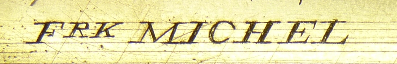
I did a bit of experimenting with different engraving styles with long straight serifs cut with an onglette and wide strokes cut with a flat, as well as tapered serifs as above, but thought I had better go back to the original material to get something authentic, so here are a selection of engraved names from locks of about the right period:-
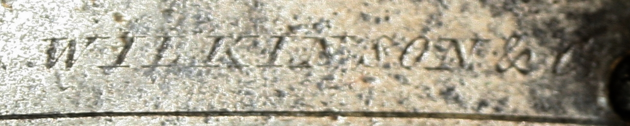
The Wilkinson is about the same date as Fred’s lock – late Flint 1810 ish,
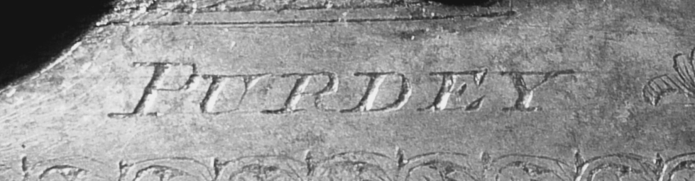
The Purdey is an 1836 park rifle and the most carefully engraved here.
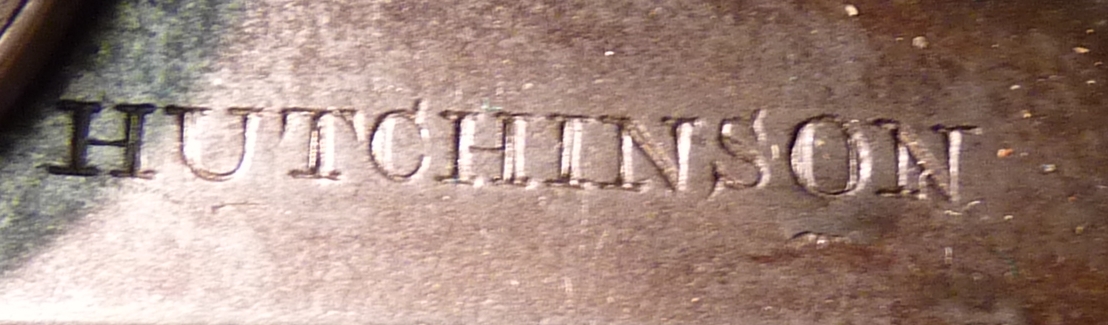
The Hutchinson is from an Irish duelling pistol of about 1790 ish.
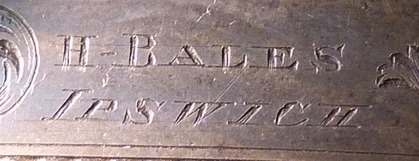
The Bales are a pair of late percussion target pistols of high quality- 1840s?

The Manton is from my tubelock of 1823 just after Manton changed engravers .
What can you deduce from these few examples?
- That straight serifs are the norm on wide ( downgoing) strokes, but may be opened up a bit on thin ( upgoing ) strokes – I’m using upgoing & downgoing in the pen writing sense here.
- Wide cuts are usually made with a square graver (i.e. a triangular cut as against a flat graver that cuts a flat bottom to the stroke) – two, occasionally three, cuts, often both from the same direction and then not overcut from the other direction. ( probably cut from the bottom with convergent cuts to even out the overall line width.
- The terminations of horizontal thin lines are triangular serifs, not straight.
- All the engraved names shown were about 1.5 to 1.8 mm high in the Caps & 1.2 – 1.5 in the small caps.
- The Hutchinson is the earliest and is typical of earlier name engraving, even that used by good makers.
- Letters with curves sometimes present problems for engravers – e.g. the ‘c’ in Ipswich on the Bales and the over wide U on the Hutchinson.
- It looks as if they almost always used onglettes for thin lines and flat serifs, at least the best engravers from ? 18xx? It takes more effort to keep these fine gravers sharp than to use a square so I guess you find the finest lines in e.g. the Purdey engraving?
- Notice how the Wilkinson ran out of space towards the end and had to use a narrow ‘S’, ‘O’ and ‘N’ to fit it in! – a problem we all face from time to time!
- The Purdey is (predictably) the only example here that I can’t fault! ( the Manton slipped on the top of the first ‘E’ and the ‘O’s differ a bit – and the middle leg of the second ‘E’ is a bit low).
So back to the bench for a bit more practice!!!! But it is encouraging as most of the engraving above has faults, so the standard isn’t perfection,
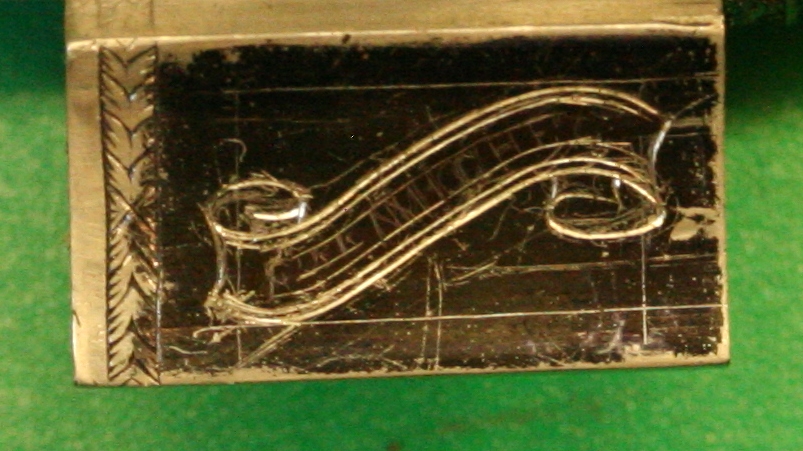
Based on what I learnt from actually looking at some guns, I had another go at lettering, and also at a small scroll for the middle of the breech block;-
I forgot as I engraved this that I intended to use small caps after the ‘M’ ! One gets carried away.
- – letter height is around 1.6mm – 1/16th inch –
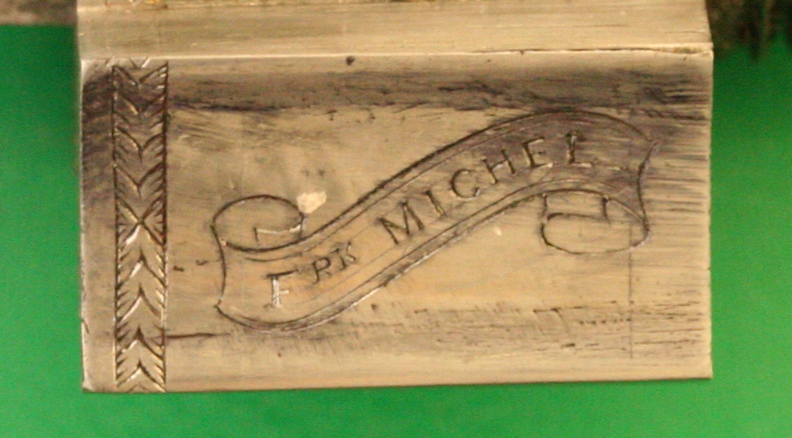
Here are some pictures of engraving the banner on the rib of the breech block of Fred’s gun No 3 – its quite small (11 x 22mm) so the pictures are at a much enlarged scale – the lettering is about 1.1 mm high. The breech block is lovely soft free cutting steel ( the colour in the photos is due to the lighting – I didn’t set the white balance) so its like cutting butter – hence this was all done push engraving and I didn’t have any significant slips, on really tough material I might have been tempted to cut the banner and frame outline and possibly the background with the GRS to avoid slips;-
Tools : I’m using square gravers in HSS and cobalt steel and having to sharpen them often to keep the points fine enough for this very detailed work. They are ground with a 1`200 hone at 45 degrees, with the heels at 15 degreees on a white Arkansas stone – I polished the main face out on some on a ceramic hone with 0.5 micron diamond paste. They need to be checked carefully before use to ensure they are actually cutting finely enough, and discarded when they begin to plough the metal or show signs of slipping. I keep at least 12 gravers sharpened the same beside me to reduce the temptation to continue if the tool is less than perfect.
Microscope: My microscope has magnifications of about x4, x10 and x25. You need to flip back to low magnification to check the overall balance and layout occasionally, although x10 will show almost all of the work here. I lay out things at x10, checking back to x4 often, and then when I’m cutting I will flip between x10 and x25, x25 is good for letter shape and positioning of the serifs, but it shows things that the eye won’t see in use but misses the big picture, so keep checking the lower magnification to get a user’s eye view.
Marking out: I use a ‘Sharpie’ to colour the work black for marking with a steel point in an aluminium modelling knife handle – a regular scriber is too clumsy! I have a number of tools for marking parallel lines from edges or cuts – for very small spacings less than a mm I use pairs of pins mounted in a piece of brass tube and glued with superglue – the pins need filing to get them close enough together, and the points need hardening or they won’t mark steel. I have an ink bow pen from an old compass with the top and bottom of the ‘nib’ sharpened for wider spacing, and a modified compass for larger spacings. It is really important to get the marking out right as the eye is very sensitive to alignment, even if it doesn’t see detail! With spacings of 1/4 mm you can see very small errors.
First I used felt pen to black the part and marked and cut the top line of the basic scroll then used a modified compass to mark out the width so it didn’t taper, and cut the bottom line – then I cut a second line inside the top and bottom of the main outline – its a quarter of a mm ( 10 thou) from the outside line – I used my 1/4 mm pair of pins – this line needs to be much finer than the first, so use a very sharp tool – I gave it a final polish on the hone with .5 micron diamond paste.
banner outline and inner line cut and outer frame and lettering guide lines marked
Having cut the scroll I mark out the lettering roughly with a scriber to get the spacing right – again, ensure that the lettering is between parallel lines accurately ruled with the compass from one of the existing cut lines.
The lettering is then roughly cut starting with the uprights keeping them just short of the marked lines, be aware of what will be the thick, down strokes and what will be the thin up strokes but don’t worry too much about the widths yet. Then put in the horizontals exactly on the top and bottom lines – if I’m going to use prism serifs (as here) I won’t put normally put horizontals at the top of strokes if they don’t have lines as it is difficult to keep the small enough. By the way, everything is being cut with a square graver, and I’ll be changing it or re-sharpening it fairly often – you’ll find that the graver cuts wider and wider lines as it wears, so watch for this and don’t let your graver turn into a plough! Curved letters are cut by making a crescent while rolling the graver out and back and finishing the top and bottom afterwards.

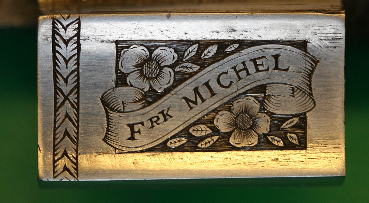
After the letters are rough cut, its time to add the serifs by angling the square graver down – it takes a bit of practice to get the angle right, and with these very small letters its quite challenging to place the graver point in the right place to begin – I use an arm rest for my forearm but it is still a challenge – you really need to position the tool to within a couple of thou – less than 50 microns . As you proceed, make sure that the ends of the strokes run cleanly into the prisms – you will find that if you go over the top of the engraving carefully with 2000 grade paper you get a much clearer view of all the things that need tidying up. The shading has been added to the scrolls to complete the 3D effect, and I’ve also cut the frame, taking great care not to run the graver into the scrolls.
(this is about the size it looks in my microscope at x 10 magnification – it IS steel, not brass!)
And here is the finished engraving – You need to mark the leaves and flowers a bit bigger than finished size as the edges get a bit battered as you cut out the background – I carefully cut it out using lines parallel to the long side, trying to keep them straight and even and make sure I don’t run into the raised bits – you may need to go at the lines in both directions as its difficult to start the line deep enough – a quick cover with the ‘Sharpie pen’ and a rub over with 2000 grit paper will highlight the bits that escaped being cut down. I’ll probably come back to the lettering at some point when I have not looked at it for a day or so and adjust the line thicknesses – I can see a few lines that could be improved, but remember that when you actually see it, it will be about this big (depending on your screen size etc) ;-
So why am I putting so much detail into it? I don’t know the answer to that!